
How To Create An Effective Landing Page
An effective landing page is crucial to all of your digital marketing efforts. In this post, I hope to demystify what a landing page is and how to make an effective one.
Why do you need a landing page?
A landing page is a dedicated website page, with the sole purpose of converting inbound traffic, taking them from viewer to lead or customer. Landing pages differ from the regular home page on your website, because the purpose of a landing page is to only make a conversion based on the offer.
A landing page, has no other information or menu buttons about your company. The idea here is to have the customer only focus on the offer, with no other distractions or ways to click to something else and never come back. Landing pages work and need to be in every savvy marketers lead generation tool kit.
What is a landing page?
A landing page (or squeeze page) is a web page designed for a single purpose. The purpose is to make a conversion, either by purchasing an item or by signing up via email for a piece of free content known as a Lead Magnet. An item and/or content can be physical or digital.
People typically come to landing pages from search engine results, email marketing or by clicking on an online ad or promotional link.
Free content is offered in exchange for an e-mail address. The thinking behind this, is once we have your email address, you have now become a ‘lead’ and we can send you offers to take you from a lead to a paying customer.
Landing pages are best used when they measure one source of traffic or a very specific audience. Try to avoid sending traffic from multiple ads or links to a landing page. A separate, targeted landing page should be created for each source so you can accurately measure the effectiveness of that source. You will also find that these landing pages convert at a higher rate.
What kind of content can be offered on a landing page?
Typically, digital content is offered often because it can be a quick and easy download, but by no means is it mandatory. I’ve personally seen people offering physical books for free!
Some typical examples that can be offered are:
- Downloading a lead magnet
- Subscribing to an email list
- Signing up to a live or pre-recorded webinar
- Requesting to try a new product, tool or feature
What is the purpose of a landing page?

Photo by Icons8 Team
Growth
- Grow subscribers and expand your audience
- Attract interest and boost engagement
- Build sales and increase conversions
Education
- Teach your audience and expand their perspective
- Build relationships and trust by bringing tangible results
- Establish your brand and your voice as an authority on the topic
What are the key elements of a landing page?

A landing page can be broken down into structural elements and psychological elements.
Both of these elements have been tested heavily from marketing professionals around the world and are proven to work. So I wanted to break them down for you and explain why they are effective.
Key structural elements of an effective landing page
- Single Web Page (with no navigational menu items)
- A Separate URL
- Form Fields
- Call To Actions (CTA)
- Strong Headline
- Powerful Hero Image
- Additional Imagery (to explain processes, people, etc.)
- Consistent Design and Copy (that matches ad or promotional link)
- Key Information “Above The Fold”
- Easy To Understand
- Sharing Options
- Privacy Policy and Terms of Service
Single Web Page
Single Web Page
A single page with no navigational menu items is needed for an effective landing page because it limits distractions from your potential lead. When a web page has other buttons, the potential lead may click one of those buttons, leave your page and never come back. When a potential lead sees your page, you want to have only two choices: a) go through with the offer or b) decline the offer.
A Separate URL
A separate URL is needed for an effective landing page for these reasons:
- It is great for SEO, as it allows you to rank in the Google search engine with researched keywords
- It helps customers convert, because the URL matches the content in the page.
- It allows the user to only focus on the content in front of them and nothing else.
Bonus Tips:
- Keep the URLs short, as you want potential leads to read and digest the information quickly.
- Keep the URLs readable, use common text and words, avoid long strings of numbers, coding and special characters.
- Do not cram keywords into your URL, as this can cause SEO backlash, with Google ranking you lower in search results.
Form Fields
Forms fields usually sit on top of the Call To Action (see below). Try to keep your form fields short and ask only for the most critical information you need. If you make your forms too long, most people won’t fill it out or opt to do it later, then never do.
Call To Actions (CTA)
A Call To Action or CTA is a marketing term which tells the user what action to take next. It is a call for the user to take a specific action and how to take that action. It is used to generate an immediate sale or response.
A strong call to action will tell the user what to do but more importantly it will motivate them to take action now. CTA’s are usually in the form of a button or link. The wording in CTA’s are crucial and powerful, especially in combination with effective sales copy throughout the landing page. A great CTA will have the implied message of ‘“Now that you’ve absorbed all of these reasons to get this widget, you should get it now before you miss out!’
A CTA can be as simple as “Sign Up Now!” or Sign Up Now and Get The Free eBook!”. However, it can be even longer and more descriptive such as “Subscribe now to our podcast, so you never miss an episode and stay up to date on the latest marketing hacks!” There is no right or wrong answer here, it is just important to test various CTA’s.
Your CTA button should have a contrasting colour from the rest of your design. The idea is to have a button that stands out and doesn’t blend in with other brand elements on the page.
Strong Headline
The headline text is typically what a person would see first along with the hero image. This is your chance to grab the attention of your potential lead. The headline can be in the form of a question or a statement but you should try to get into the mind of your prospects. The headline needs to clearly indicate the benefits of the offer.
Questions to ask yourself
- What is your prospect’s goal or destination?
- How does your offer get them to where they want to be?
- What results can you give your prospect?
- If your offer is free, how can you emphasize that?
Powerful Hero Image
The hero image is the primary image that people see. The image should be a visual representation (or related) of your offer or Lead Magnet.
Bonus Tip: Use visual cues in your hero image to help guide the visitor to what is important on the page. This can include check marks, arrows, highlighting or an image pointing towards the important element. Peoples eyes generally follow what an image is pointing to.
Additional Imagery
Just like your hero image, additional imagery can be a powerful tool to convince potential leads on taking up your offer. They should never be distracting or take away from the main image.
However, additional images become very useful when they can convince a person on how easy a process is or uses recognizable faces or brands.
Images speak a thousand words, so an image can do quickly what it would take a person some time to read. Remember, people are making decisions about your offer very quickly, so you want to communicate your offer quickly and effectively.
Consistent Design & Copy
It is important to have a consistent brand (design and copy) that matches your ad. If you use certain imagery or text in your ad, that same imagery (or similar) should be in your landing page. When a user clicks your ad they expect to get what they clicked on. If they click an ad and it looks different, or feels different — a lot of people will bounce and close the page. Similar branding allows the person to make the mental connection that they are in the right place and that they haven’t been duped. The brand of your landing page should also match your overall company brand as well, for even more consistency.
Key Information “Above The Fold”
Above the fold refers to the content you first see when you go to a website on a desktop or mobile device without scrolling. The fold in digital terms refers to the bottom of the screen where additional information is not seen until you start scrolling.
Is it crucial to have your most important information, including your Call To Action (CTA) button above the fold because most potential leads will not scroll your whole page.
Easy To Understand
Your landing page needs to be clear, concise and easy to understand. Your landing page should have a single offer and a single message. Try not to complicate your landing page with multiple offers as that can confuse visitors. Visitors should be able to understand your page within 5 seconds, if it is longer than that, you run the risk of losing them.
Bonus Tip: Perform a 5 Second Test with friends and colleagues. Give them 5 seconds to look at your landing page and see if they can understand what the page is about and what the offer is.
You can also use this free online tool to perform the 5 Second Test online.
https://fivesecondtest.com/
Sharing Options
You want to make your landing page easy to share on the most popular social media channels as well as options for email. Some of your visitors may have audiences of their own, and you want to make it easy for them to share your landing page.
Privacy Policy and Terms of Service
It is a good idea to have a privacy policy or terms of service for anyone coming to your landing page. Some companies like Google, require it. But it also helps build credibility and trust with your offer and company,
Take a look below at some examples of Landing Pages we created for clients.
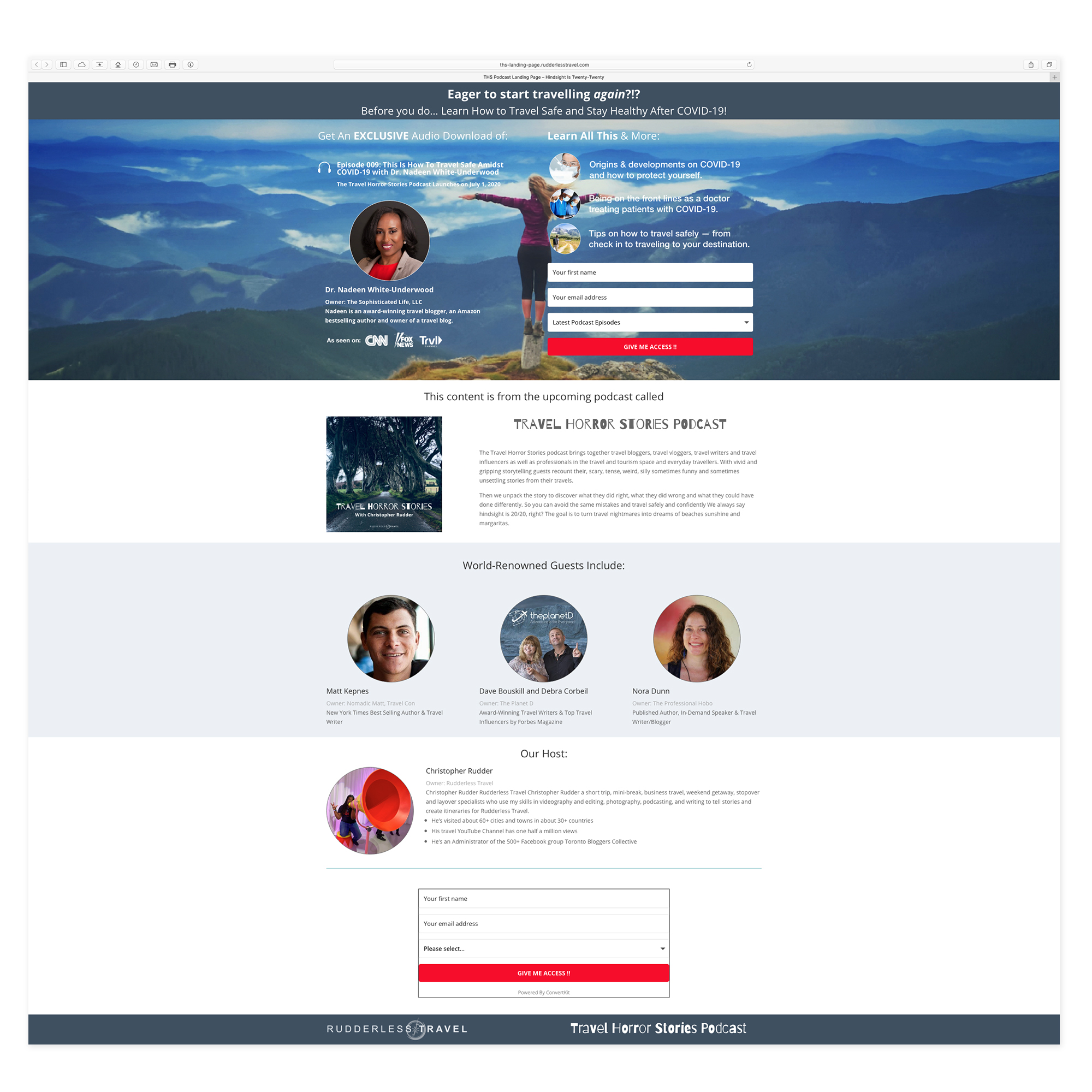
Client: Travel Horror Stories Podcast

Client: Say It Loud – Flip Fly Floss Webinar

Client: FitNance IQ – Free Consultation and Tip Sheet
Key psychological elements include
- Social Proof
- Testimonials
- Client Lists
- Ratings
- Media Features
- Well Known People and Companies
- Followers – Visitors/Views/Subscribers/Downloads
- Value & Results Messaging
- Ease of Use
- Time Constraints
Social Proof
Social proof is a key psychological element in creating an effective landing page. Social proof boosts your credibility amongst your potential leads. People typically want to get information quickly about an item before they sign up or buy it. Social proof allows them to do that by showing them all these great people and companies that have bought this already. People generally feel at ease about buying something, if they know that so many other people have bought it before them.
Social proof even works greater when the person or company is bigger in stature. For instance, if you are able to say Walmart Inc. or Oprah Winfrey is one of your clients, it makes the buying decisions easier for the average person, because these entities are most likely bigger than them.
Testimonials
Written testimonials from your customers or clients can be highly effective, because it lets the lead know that other successful people or companies have bought the product and they have taken the time to illustrate this for your brand.
Bonus Tip: To boost your credibility – use a real person, try not to make up people or companies. Use their photo, their real name, position/title, and company name, if possible. This also works better when the person is well known in your industry.
Client Lists
Showing companies who purchased your product. This again, works even better if the companies and brands are well known.
Bonus Tip: Use their logo rather than just the company name. As it is visually more appealing, recognizable and easier for a potential lead to gather the information needed to quickly make a purchasing decision.
Ratings
Ratings are another form of social proof. They again, allow a customer to make a quick decision about your product or service based on other people’s feedback. If you sell a product, own a retail store or restaurant, or offer a service that has a ratings system — it is wise to use your high ratings as a conversion tool. Amazon, Yelp. Google My Business, and many more offer star ratings. So if you have a 5 star rating on Amazon, for example you should use it to help convert some of your leads. The additional benefit of this, is that customers can quickly look this up, to see if you are telling the truth. But definitely DO NOT provide them any links to leave your page to check it out.
Bonus Tip: Use a “5 STar” visual to communicate your high ratings. Pictures speak to potential customers in this case, more than words can.
Media Features
If your brand has been featured in any form of media, especially if it is prominent or credible media, it is a great idea to mention it here. Media shows the potential lead that other unbiased outlets agree that your product or service is amazing.
For this purpose, it is a good idea to actively seek out media features, specifically for this purpose. Being featured in the media allows the user to make decisions quicker. The thinking is “if this person is featured in all of these prominent media outlets, it must be legitimate.”
Bonus Tip: Use their logo rather than just the media outlet name. Just like client list logos — it is more appealing, recognizable and easier for a potential lead to make a quick purchasing decision. Again this works best with well known media outlets in your industry, but you should use whatever you have until you get more.
Well Known People or Companies
Another tool you can use in your social proof arsenal is featuring a successful and well known CEO, host, marketing or sales professional, guests, partners or sponsors to help sell your landing page. The thinking works the same way as other social proof tools, in that it let’s people know that all of these people who are probably more successful than you are using it — so who are you not to use it?
Followers – Visitors/Views/Subscribers/Downloads
If your blog, podcast, app, YouTube channel or any other form of content has a lot of views, likes, subscribers, downloads, etc. You can use this as a powerful tool to convince visitors on why they should take up your offer.
Value & Results Messaging
It is important to communicate the idea of tremendous value on your landing page. The perception you want your user to have is “They are providing all of this value for free or for a low cost. The value is clearly worth more than the cost”
It is best to communicate value, preferably with bullet points. Keep your bullet points short and to the point. People can read and digest the bullets fairly quickly, and come to a quick decision on why they should take the required action.
The most effective marketing showcases a clear transition for the consumer. For example, in simple terms — “Right now you are poor, but after you take my course you will be rich.” The transition here is from poor to rich. This is also called Results Messaging. You are clearly communicating to consumers that you are ‘likely’ to get these results, if you take my course, or read my book. I use the word ‘likely’ purposely because most marketing does not guarantee results, but makes you feel the results are guaranteed.
It is important for you to communicate to the person that we are providing all of this value, and when they finish consuming it, they will transition from where they are now, to a new better version of themselves.
Ease of Use
It is important to communicate the ease of use with the offer and how to use the offer. You need to illustrate that the product you are signing up for is easy to use and won’t cause you any additional work or time to get the desired results.
Ease of use also applies to how to get the offer. Getting the offer should not appear time consuming or effort intensive. You want the process to be quick and easy. If it appears to take a long time to do, most people won’t do it.
Time Constraints
Real time constraints have a powerful effect on the human psyche. A marketing time constraint, gives the potential customer a time limit of when they can get the offer. They work best when time constraints are for a short period of time, like 24 hours, or two days. This makes them feel like they have to act now, or they will miss out on the deal, so it motivates them to take action now — not tomorrow, or next week.
Bonus Tip: Make your time constraints real. It is important that if you tell your potential leads that this deal ends tomorrow at noon — it should end at noon tomorrow. If the customers realise that your constraint isn’t real, and it will be back again next week — the urgency of acting now is lost. Credibility in your offer must be real.
A trick that some marketers use is, once the deal is done, they will send up a follow up message along the lines of “We’ve had so many people sign up for this service, and some had missed the deal… so we want to extend it for another 24 hours.” This allows them to scoop up any last deals left on the table, and gives people another chance to accept the deal and earn more sales.
If you would like to get a quote on creating your next landing page, please click the button below to contact us!


Leave A Comment